Enhancing YouTube Shorts
Encouraging organic content exploration through the power of user choice
Throughout the Spring 2023 semester, my team at Berkeley Innovation conceptualized a curated YouTube Shorts browsing experience based on identified user motivations and existing feature gaps. As a returning consultant and the Ideation lead, I led three other product designers through an iterative design process to deliver high-fidelity solutions.
Problem
With Shorts as a relatively new player in the short-form content competitive landscape, users often complain that the Shorts they receive on their feed are not relevant to their interests. To become the leading platform for short-form content, we need to improve personalization and interpersonal connection.
Outcome
My team collaborated with an Interaction Designer at YouTube to deliver high-fidelity UX solutions, as well as a comprehensive user research report based on contextual inquiries, landscape analysis, and primary research. Our features are projected to increase user engagement metrics, contributing to business goals.
Role
Ideation Lead
Timeline
Feb - May 2023
Tools
Figma, FigJam
Team
4 Designers
1 Project Lead
1 Stakeholder
Disciplines
Mobile Design
Iteration Design
Future Vision
SOLUTION PREVIEW
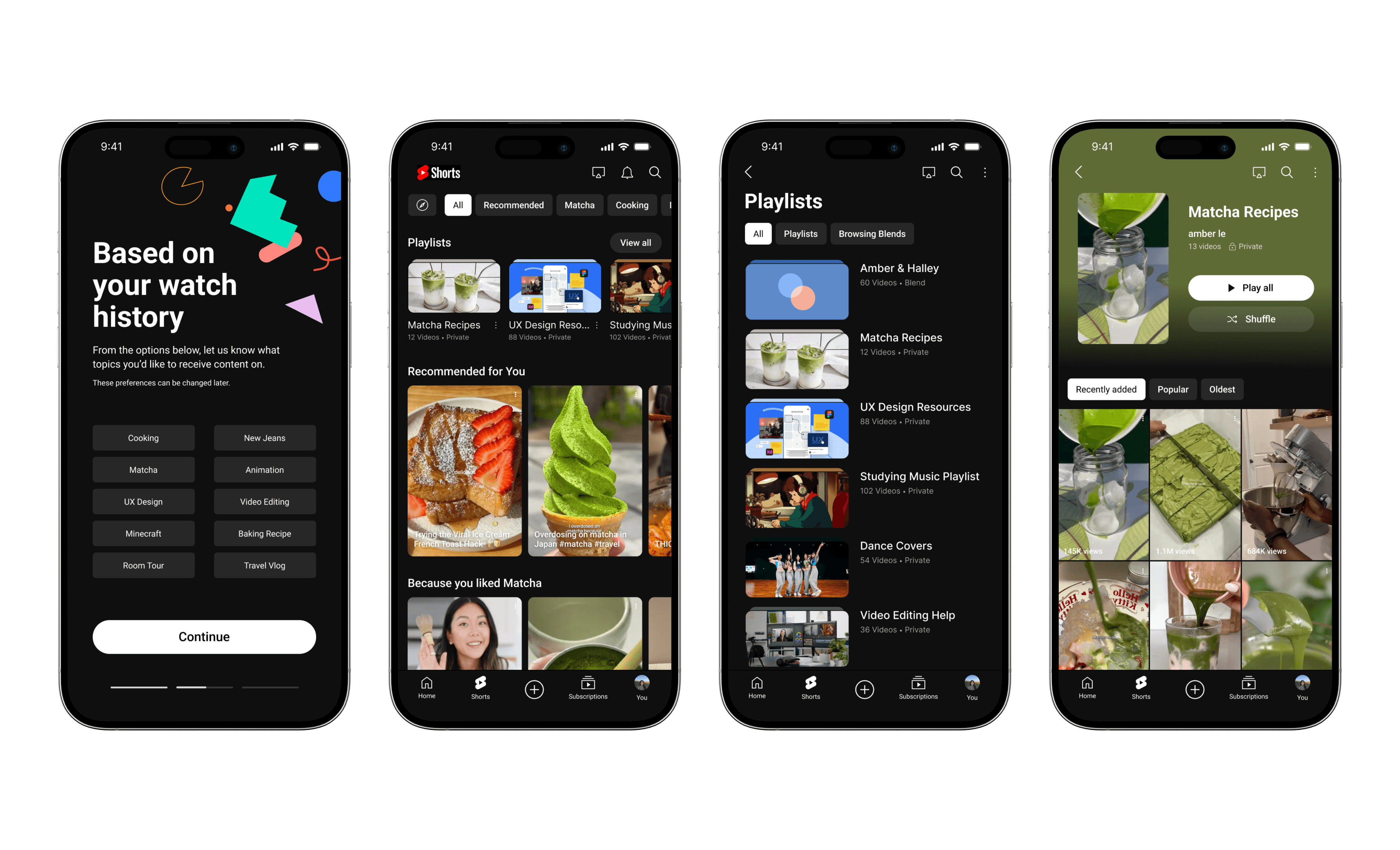
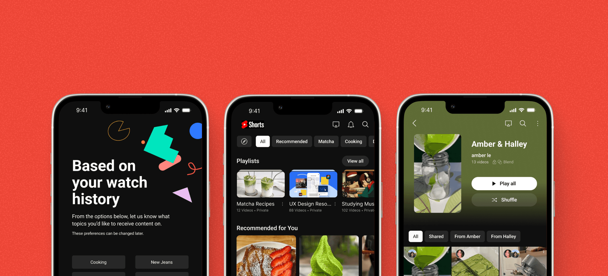
Personalize your algorithm before you browse through the YouTube Shorts Onboarding Form
Personalize your Shorts experience to your preferences by selecting topics of interest and exploration based on watch history and trending content.
Empower your browsing experience by choosing content in the Shorts Dashboard.
Select content or topics that pique your current interests in the Shorts Dashboard, a seamless connection between YouTube and Shorts.
Personalize and further inform your algorithm by collecting liked content in Playlists.
Save and collect liked videos in personalizable Playlists for later viewing, which can easily be accessed directly from the main Shorts Dashboard.
Generate a Browsing Blend to nurture and strengthen organic relationships with friends.
Foster connections with friends through Browsing Blends, a feature where Shorts will generate a curated playlist with you and a friend's algorithm, creating conversation topic opportunities by locating similar interests.
Introducing Shorts
YouTube is the leading online video sharing and social platform, garnering over 2.7 billion monthly active users and over $29.24 billion in annual revenue (2022). In September 2020, they launched YouTube Shorts, a lightweight and mobile-optimized experience centered around vertical, full-screen videos. While Shorts is also available on web, we were tasks to focused on the mobile application experience for this project scope.
BACKGROUND
Defining our users
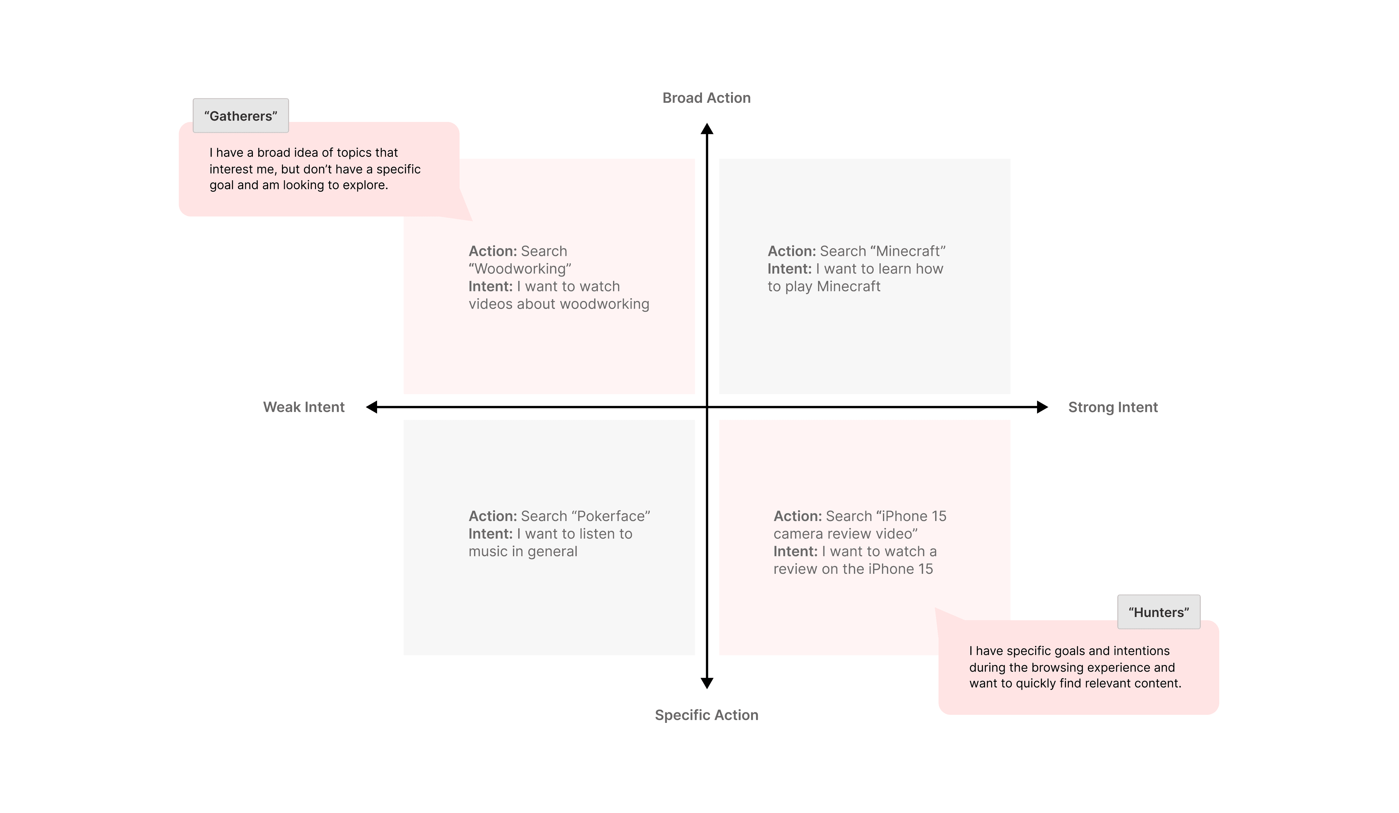
Our point of contact at YouTube told us that there are four distinct types of defined users, ranked on a 2x2 matrix comparing intent and action. Throughout the course of this project, he asked us to focus on the needs and motivations of two these user types — the Hunter and the Gatherer. While the hunter has specific ideas of what kind of content they're looking for in the browsing experience, the gatherer has general topics of interest but is willing to explore.
THE PROBLEM SCOPE
Finding relevant and quality content when you're just browsing is hard.
As a relatively new player in the short-form content space, current users of YouTube Shorts have expressed the lack of interesting and quality content in their feed. Because of this, users tend to favor competing platforms over Shorts. With this problem in mind, our contact from YouTube was looking to uncover why this occurs and approached my team at Berkeley Innovation (human-centered design consultancy) with the following question:
HOW MIGHT WE…
Improve the Shorts browsing experience so that hunters and gathers can more easily find content that is relevant to their interests?
Because this project was exploratory and wasn't constrained by business needs or technical limitations, our contact emphasized creativity and out-of-the-box thinking to guide our process. With this in mind, we approached the problem using the four-sprint method (Research, Synthesis, Ideation, Prototyping).
GETTING STARTED
Setting our research goals
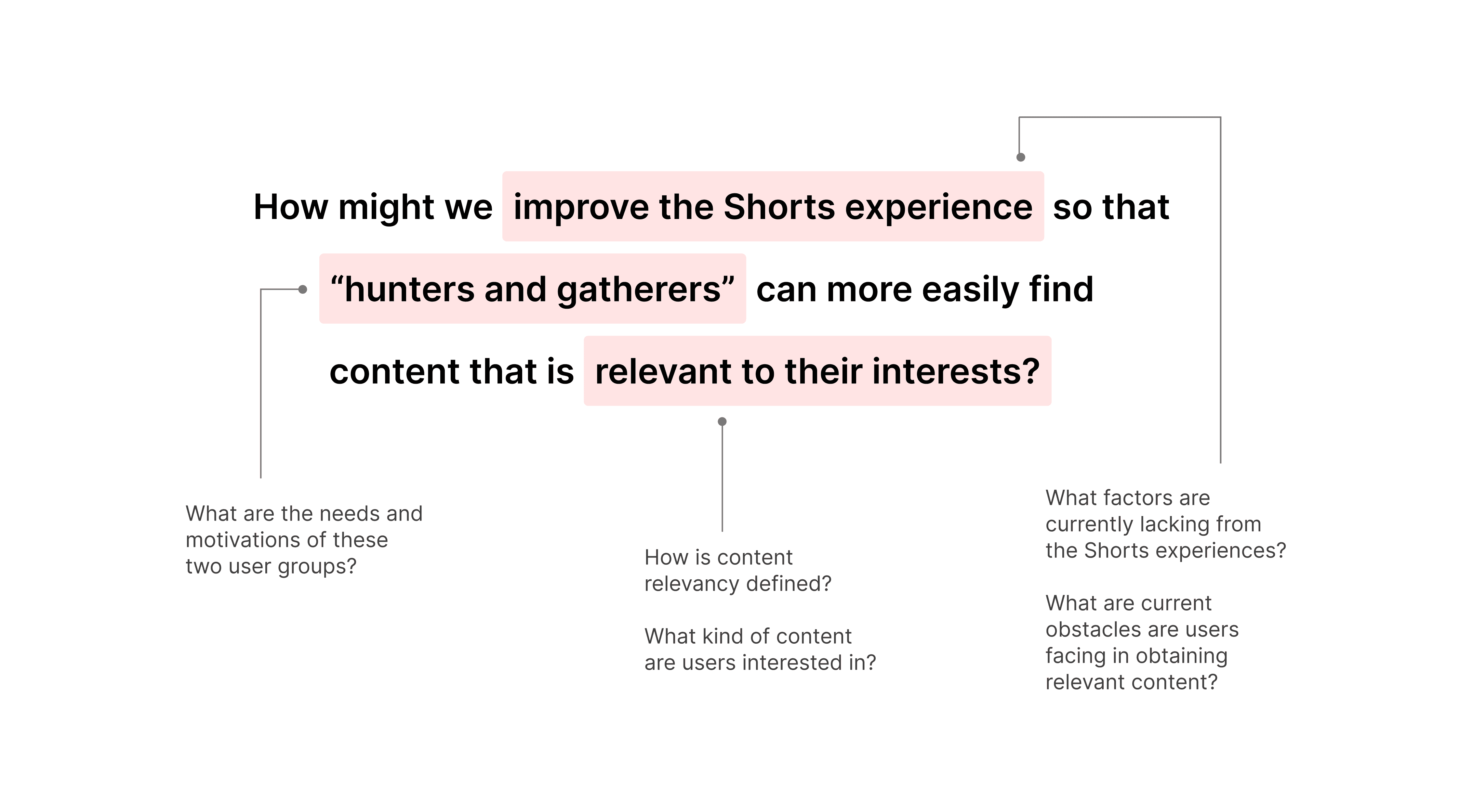
Before diving, I dissected the given project scope to understand the desired goals in greater depth. Breaking down our given "How Might We" question provided us with research objectives to better guide our design thinking process. Doing so allowed me to generate smaller subproblems that we aimed to accomplish during research so that we could consolidate which methods we wanted to conduct during our research sprint.
COMPETITIVE AUDIT
Understanding the short-form content landscape
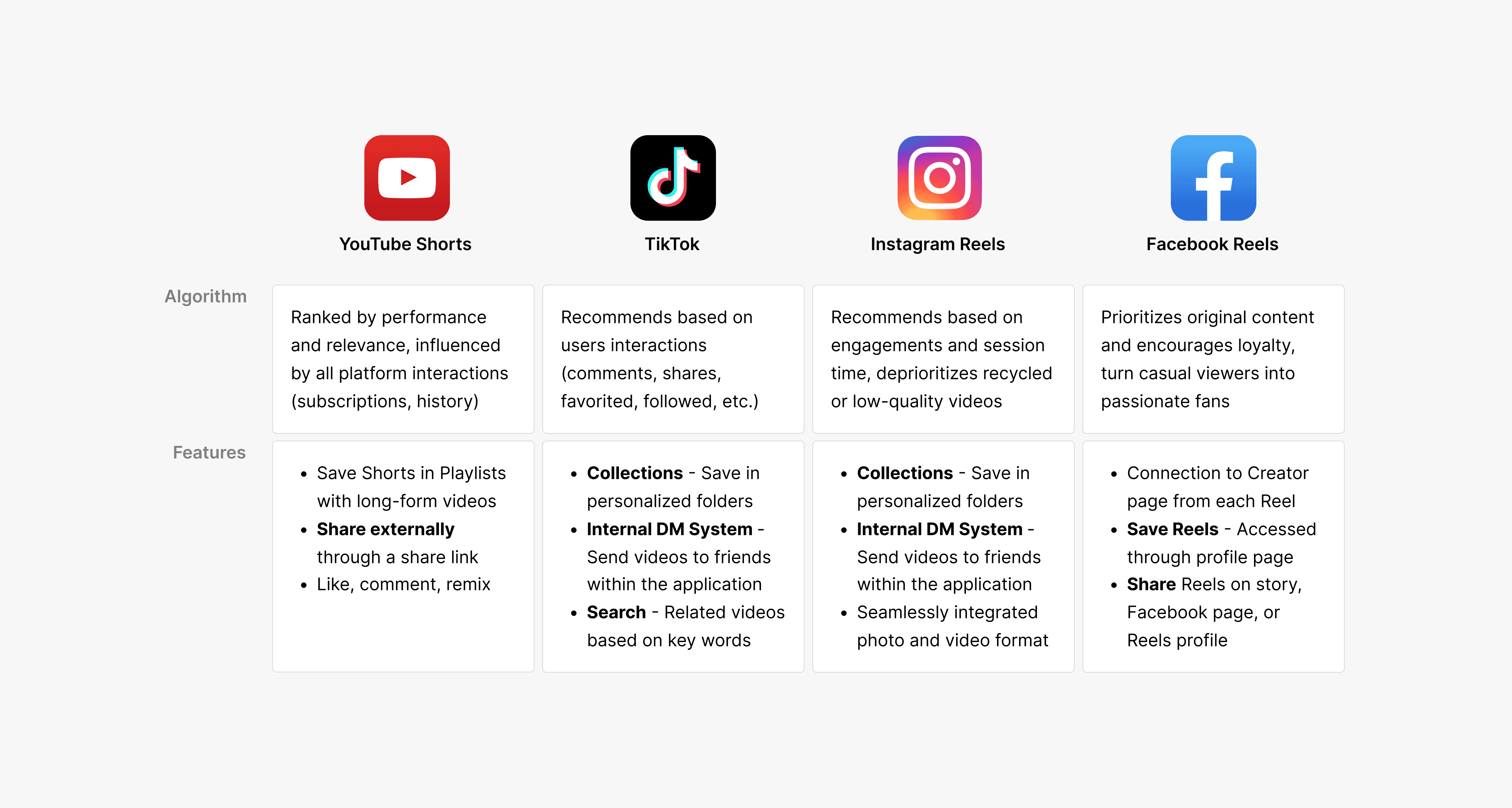
With this context in mind, we then conducted a competitive audit of the top players in the short-form content field, including TikTok, Instagram Reels, and Facebook Reels. Through this, we analyzed the browsing mechanisms of each platform and took notes on available user functionalities and how the algorithm provides recommended videos to their users, allowing us to compare Shorts against best-in-class short-form platforms to identify areas of opportunity.
USER RESEARCH
Observing user perceptions and behavior
Although we recognized that YouTube Shorts had a less-than-ideal user experience during our competitive audit, we wanted to hear first-hand from our users to understand their motivations behind watching short-form content, allowing us to pinpoint in what areas Shorts fails to address those needs.
🗒️
User Survey
Locate common themes in what users desire in their short-form content experience, as well as understand how content relevancy is defined
💬
User Interview
Supplementing understanding on user needs and pain points with anecdotal data on previous browsing behavior and experience friction points
👀
Contextual Inquiry
Observing first-hand how both new users and old users interact with YouTube Shorts through unmoderated browsing and interaction tasks
KEY TAKEAWAY
Relevancy — how is it defined?
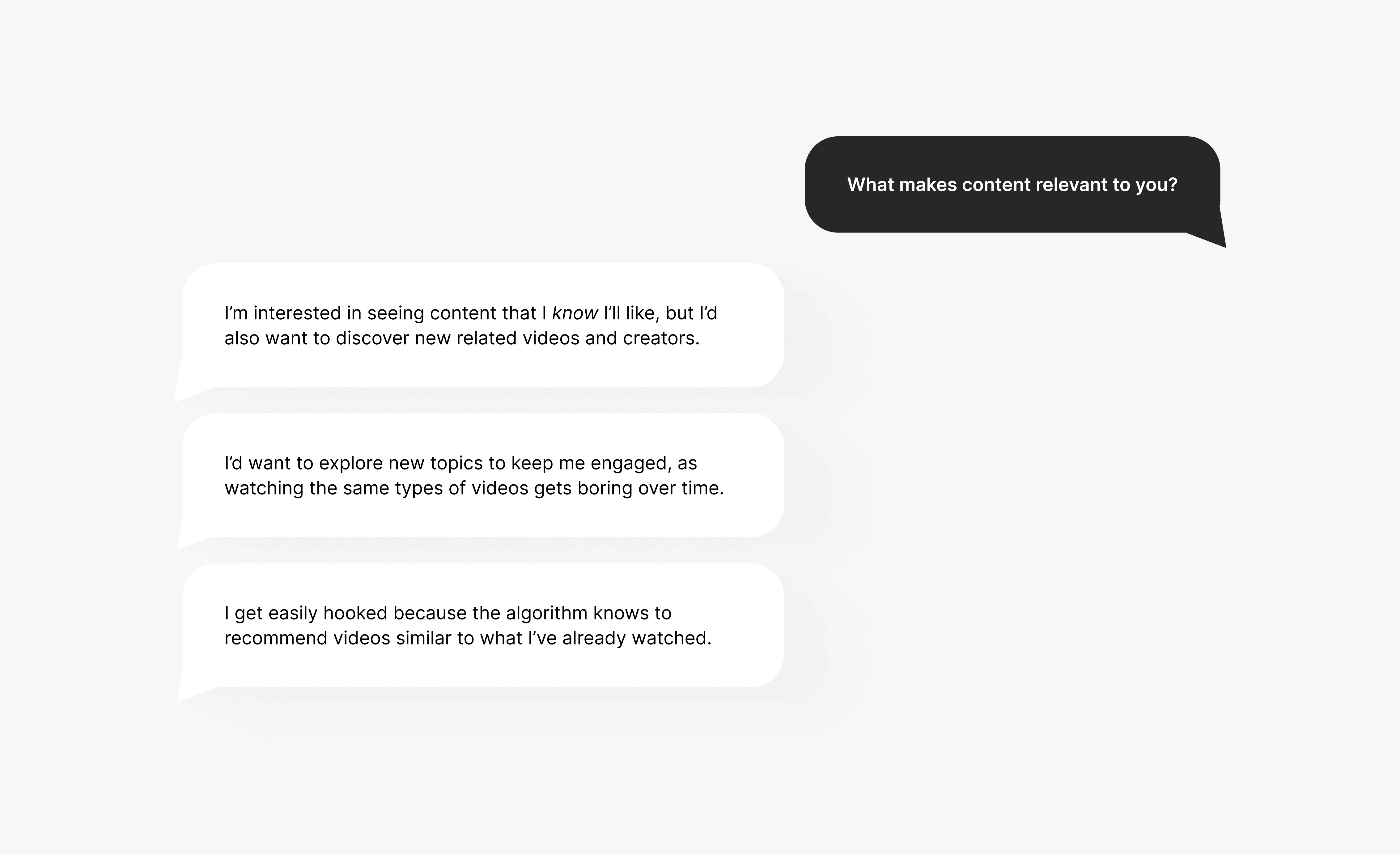
Showing users relevant content is the core purpose of any entertainment platform, and is even more important for short-form content. Videos must catch the attention of users within the first few minutes before they are are unengaged. Showing users videos that are relevant to them is pivotal in not only providing a satisfactory user experience, but encourages users to continue returning back to the platform. Therefore, we aimed to understand how users define content relevancy. Through our research, we learned that while users want to watch familiar content, balance with exploring new content is important.
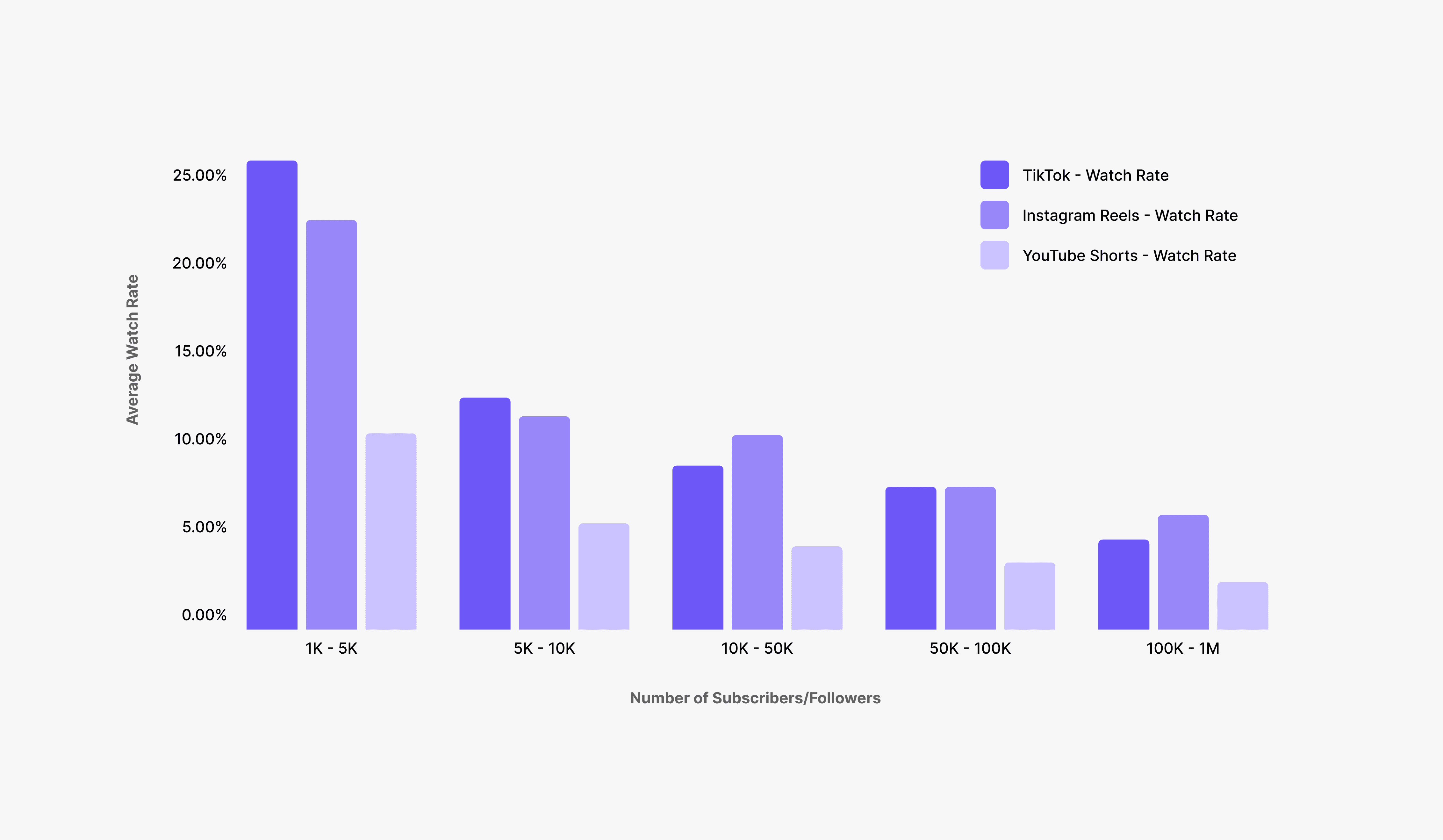
However, this balance is something that is not being addressed in the current Shorts experience. This finding is supported by data points from white paper research comparing average watch rate of short-form content platforms. The low average watch rate on Shorts provides insight into the poor content relevancy and the lack of effectiveness of retaining user attention. Users are unlikely to watch videos that are not relevant to their interests.
THE CORE PROBLEM
YouTube Shorts isn't addressing important user needs.
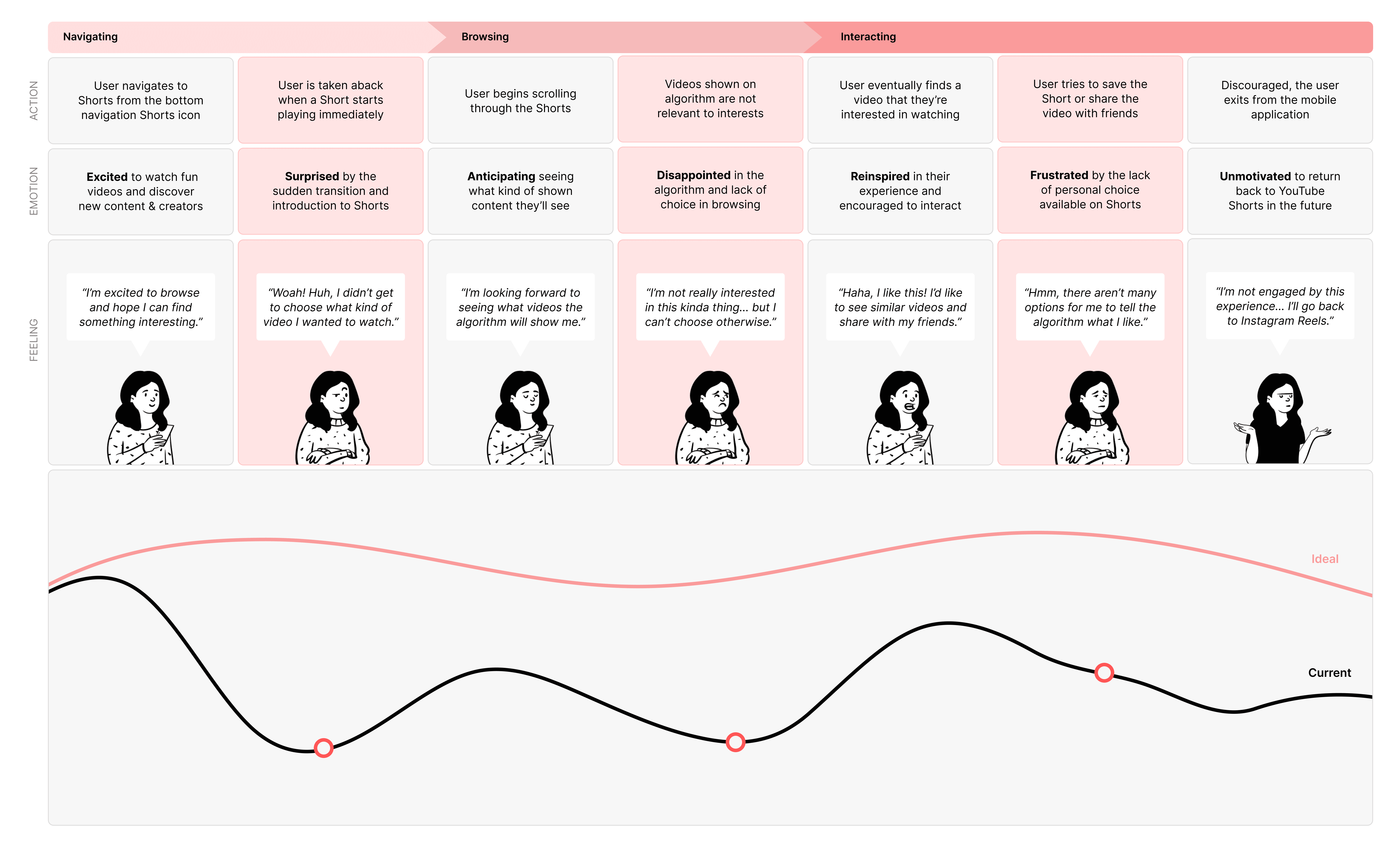
With all of our research methods completed, we now had a stronger understanding of our user needs and motivations regarding short-form content platforms. Synthesizing our collected data points through affinity mapping, we ultimately recognized three key user pain points in the current Shorts experience:
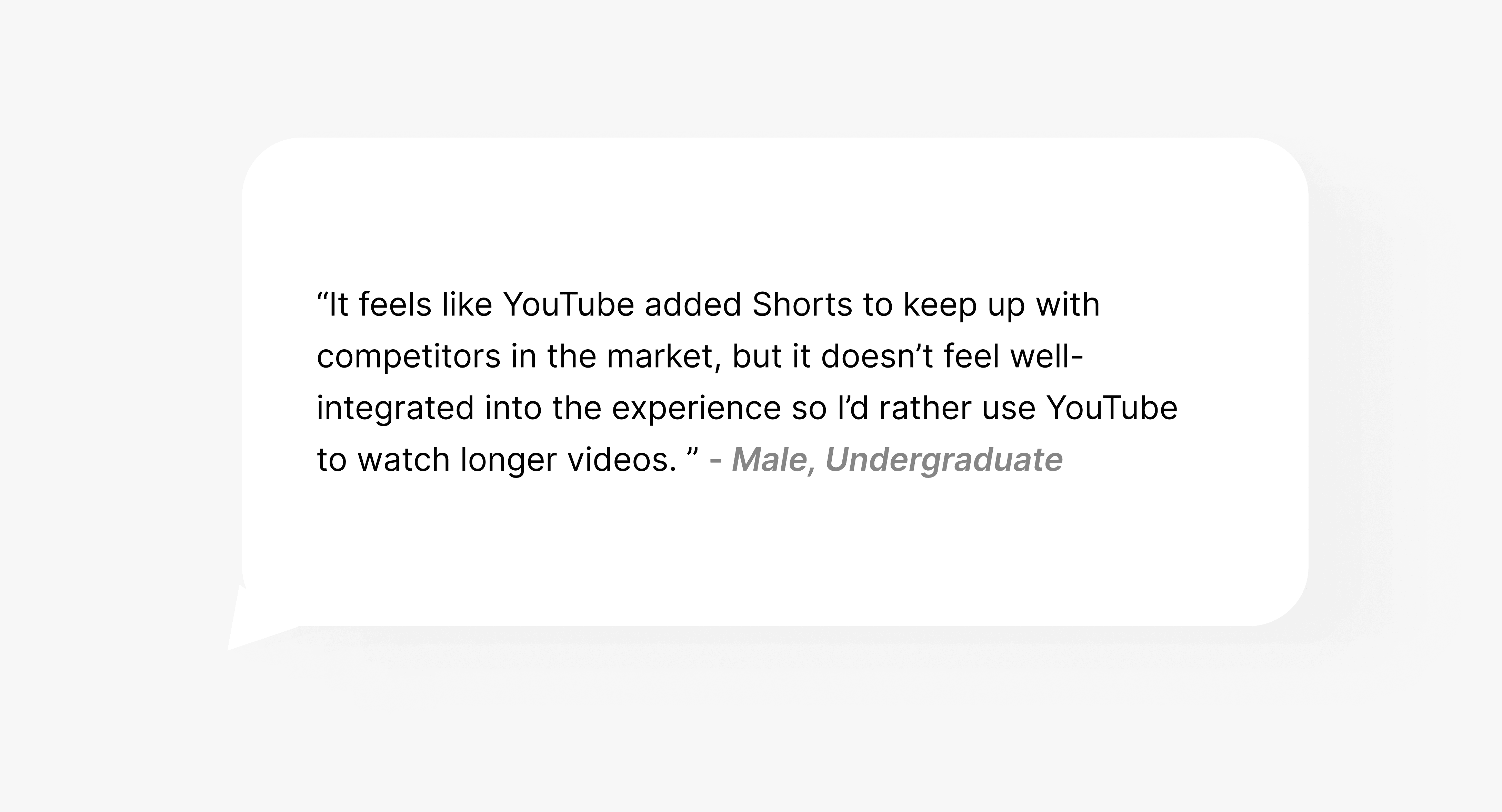
Disjoint between Youtube and Shorts
Unlike competing platforms that have seamlessly integrated other content types like pictures and videos, the connection between YouTube and Shorts feels clunky and disjoint. Because of this, users have trouble accepting Shorts and would rather use YouTube as a long-form content platform.
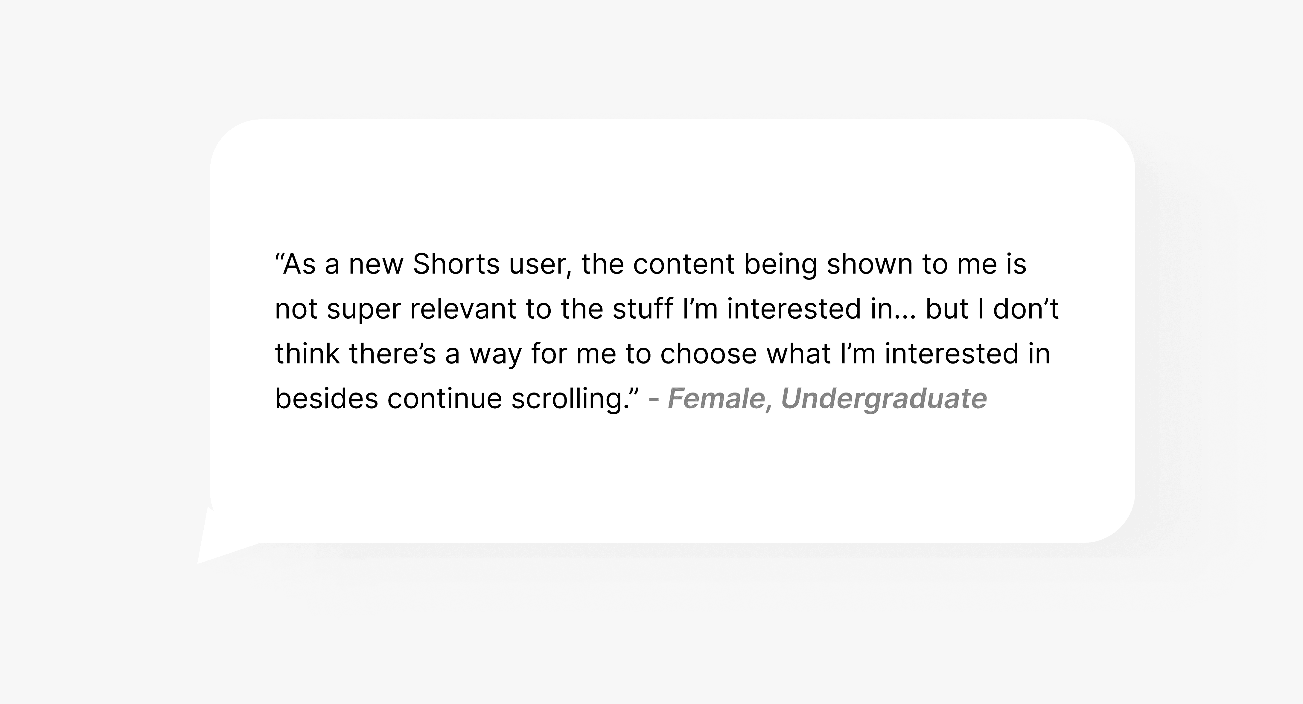
Lack of user choice
YouTube Shorts provides no direct way for users to personalize the algorithm to their watching preferences. Users are forced to continue scrolling until they receive a Short that they enjoy — they can't choose what kind of content they begin their browsing experience with or when the content changes.
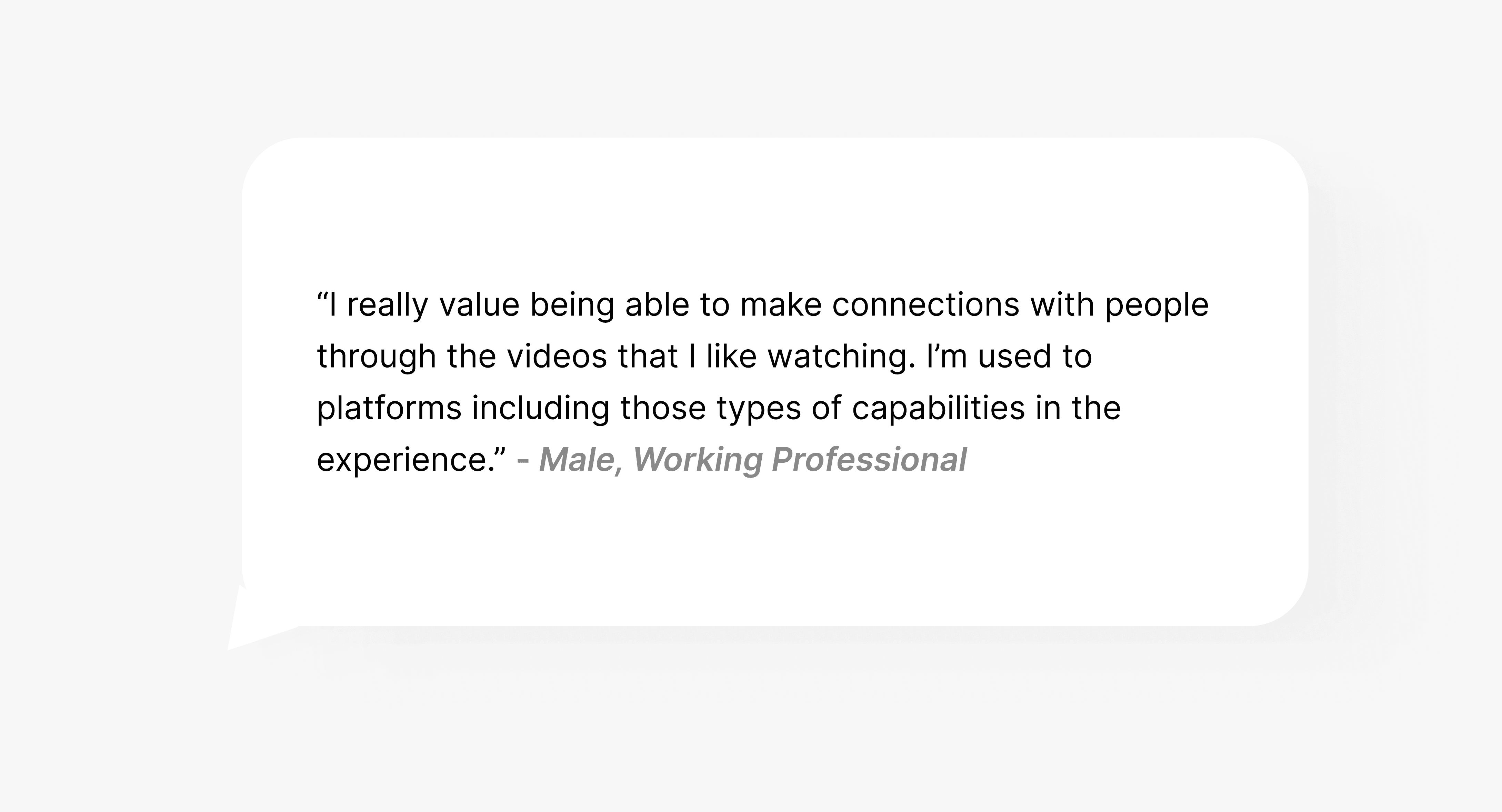
Interpersonal connection is not optimized
77.2% of survey respondents expressed that the main reason that they watch short-form content is to build connections with friends. Without the ability to easily share Shorts content to incentive conversation, users are not motivated to return back to the platform, even if the content interests them.
Therefore, both hunters and gatherers are quickly discouraged by a Shorts experience that differs from their expectations. When hunters have specific goals in mind, they have no way to choose which content they watch. While gatherers are more exploratory, once they find content that interests them, they are unable of letting the algorithm know and are stuck scrolling. The three key friction points in the experience deter users from remaining engaged.
THE GOAL
Create an elevated Shorts experience
After locating these pain points, we wanted to create a solution that empowers user choice in the browsing experience, supports the ability to create personalized experiences, and builds connections between users. Addressing these needs in our design will create a YouTube Shorts experience will successfully encourage a higher watch rate, increased user engagement, and decrease user turnover.
OUR SOLUTION
YouTube Shorts Dashboard
With the key insights identified, we began our ideation sprint. As the lead for this sprint, I was responsible for setting design goals and determining the roadmap for the sprint, while still working alongside the team as a designer. To begin, I hosted an open-ended ideation discussion. After converging on our ideas, each member of the team was interested in creating a YouTube Shorts dashboard, which would be accessed from the bottom navigation bar. We decided to focus on this touch point since this caused the most friction in the experience based on contextual inquiry sessions.
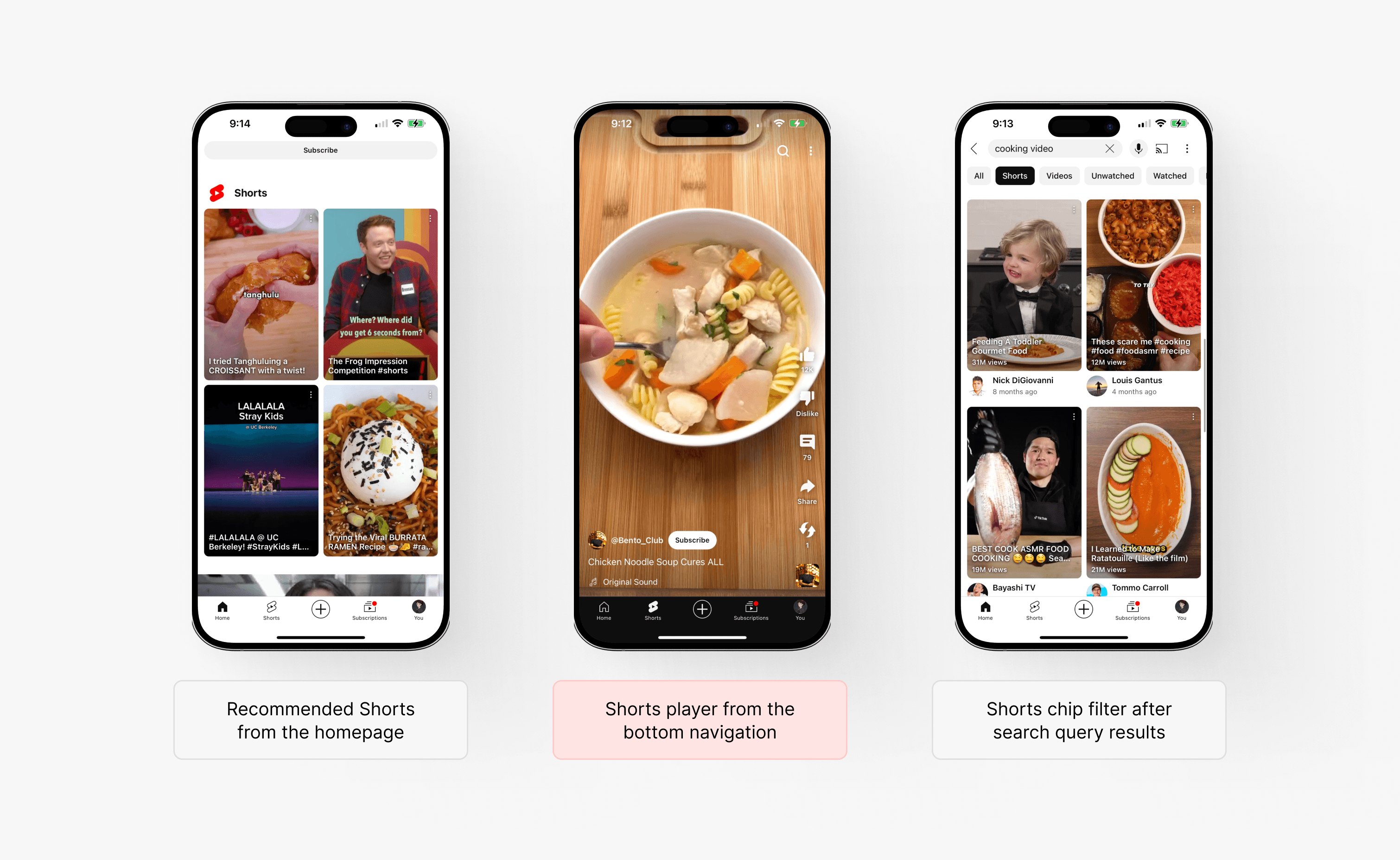
Address the touch point causing the most friction
With Shorts having three unique access points where the user can enter Shorts, we understood that we needed to narrow down our scope to ensure that our solution has the most impact but was also feasible in the remaining timeline. Referencing back to our contextual inquiries and observing which flow caused the most pain, we decided to focus on how users access videos through the Shorts player tab in the bottom navigation.
IDEATION
Guiding our solution thinking
Now that we had a general solution concept, we needed to understand which elements we were moving forward with in consideration to our timeline. After discussing each brainstormed idea, we ranked each idea based on feasibility and impact and created a prioritization pyramid based on our conversations. From these exercises, we decided to move forward with necessary features for our proposed solution rather than the "nice to have" ones.
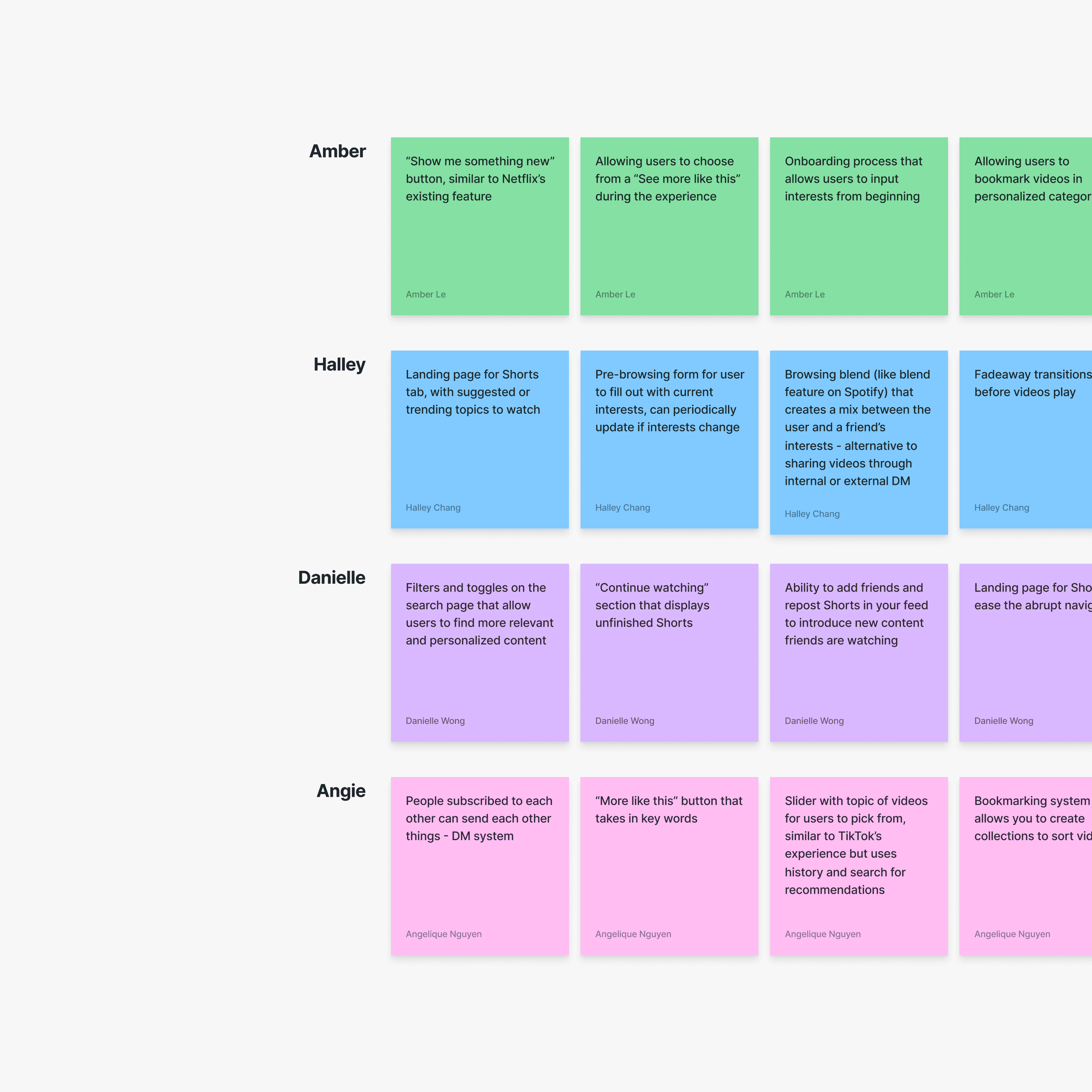
Crazy 8's Rapid Ideation
Each designer took 8 minutes to brainstorm all potential solution ideas without limitations, generating enough concepts to further narrow down during converging. We then found common ideas through affinitizing.
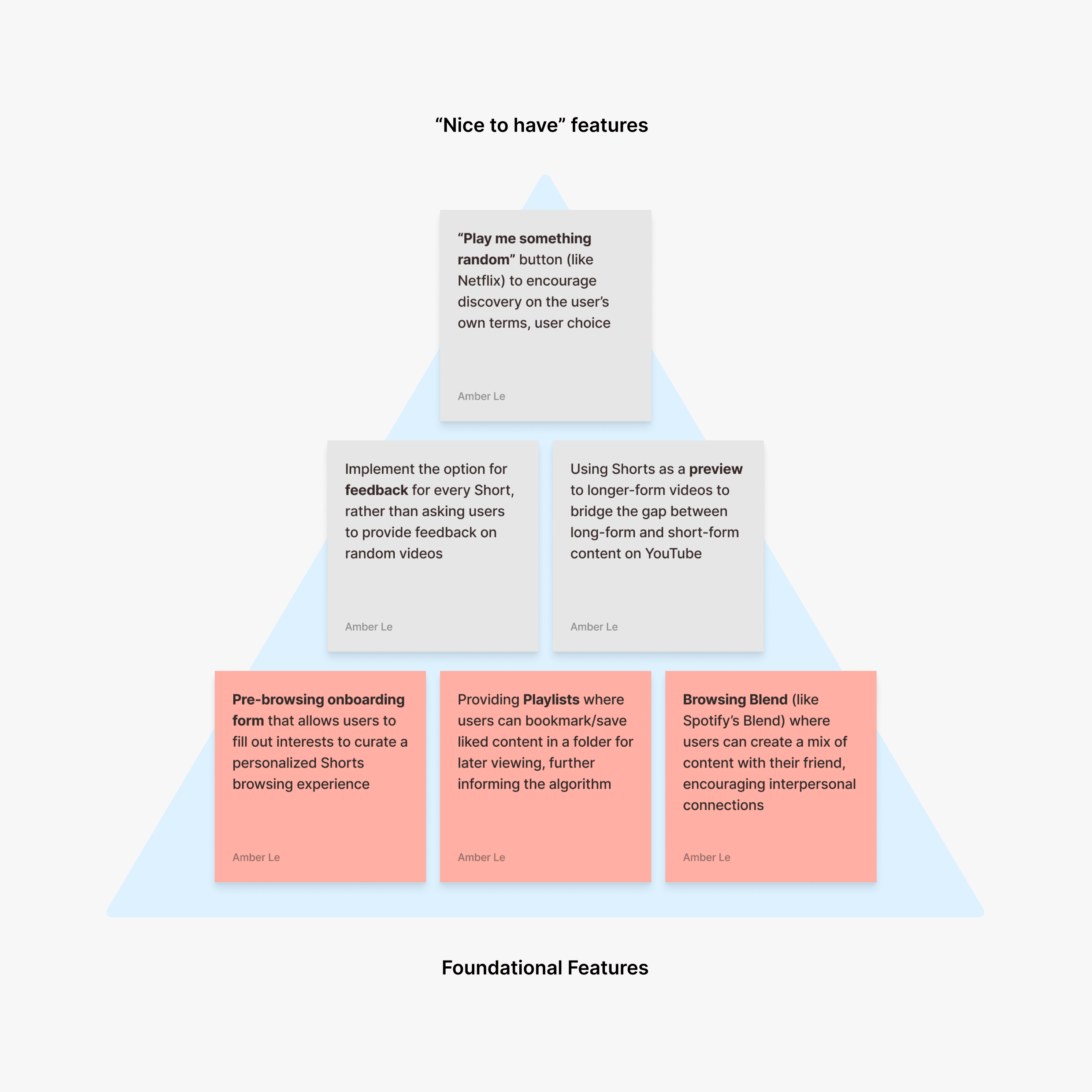
Feature Prioritization
From here, I led the team to vote on which supplementary features we wanted to prioritize. We moved forward with the necessary solution ideas that address the scoped out pain points, referencing our key insights.
OUR SOLUTION FEATURES
Introducing onboarding form, playlists, and Browsing Blend
During feature prioritization, we recognized that there were many solutions that we could move forward with. However, referencing back to our key insights, we wanted to ensure that users had a chance to personalize their algorithm, create customized experiences, and build connections. Therefore, we moved forward with three features — an onboarding form, playlists, and Browsing Blend — as these ideas would provide direct intervention to those pain points.

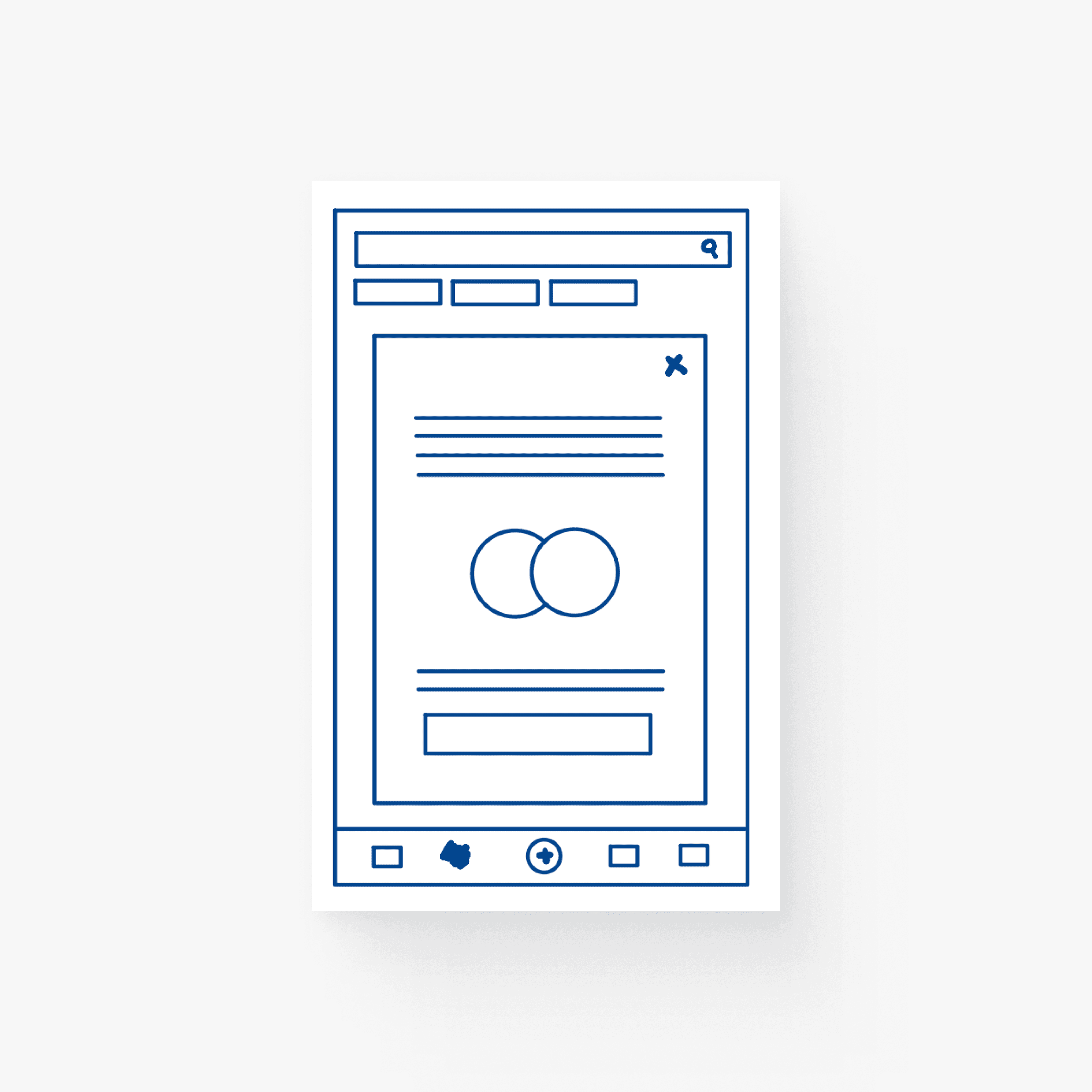
Pre-browsing onboarding form
Provides users with an actionable step during onboarding, allowing them to create a browsing experience personalized to their interests
Shorts Playlist
Promotes personalization by allowing users to save enjoyed content for later viewing, further informing the algorithm on topics of interest
Browsing Blend
Encourages content exploration and connections with other people by generating collaborative Shorts playlists between users' algorithms

INFORMATION ARCHITECTURE
User Flow Diagram
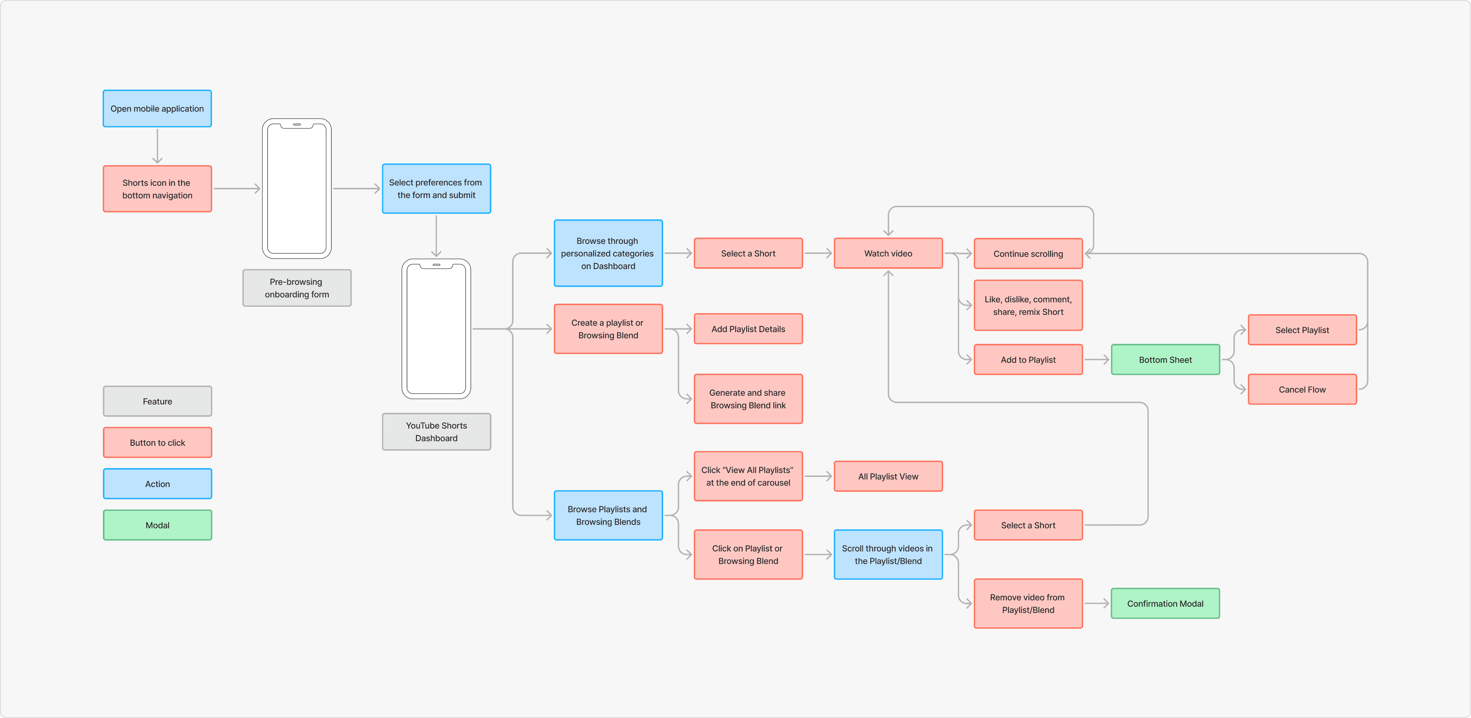
DESIGN EXPLORATIONS
Medium-Fidelity Mockups
With our concepts consolidated and after creating mid-fi mockups, we conducted two rounds of testing with our previous interviewees to get feedback on our designs. From this, we made three major design decisions to our solutions to ensure that our designs were addressing the user points effectively.
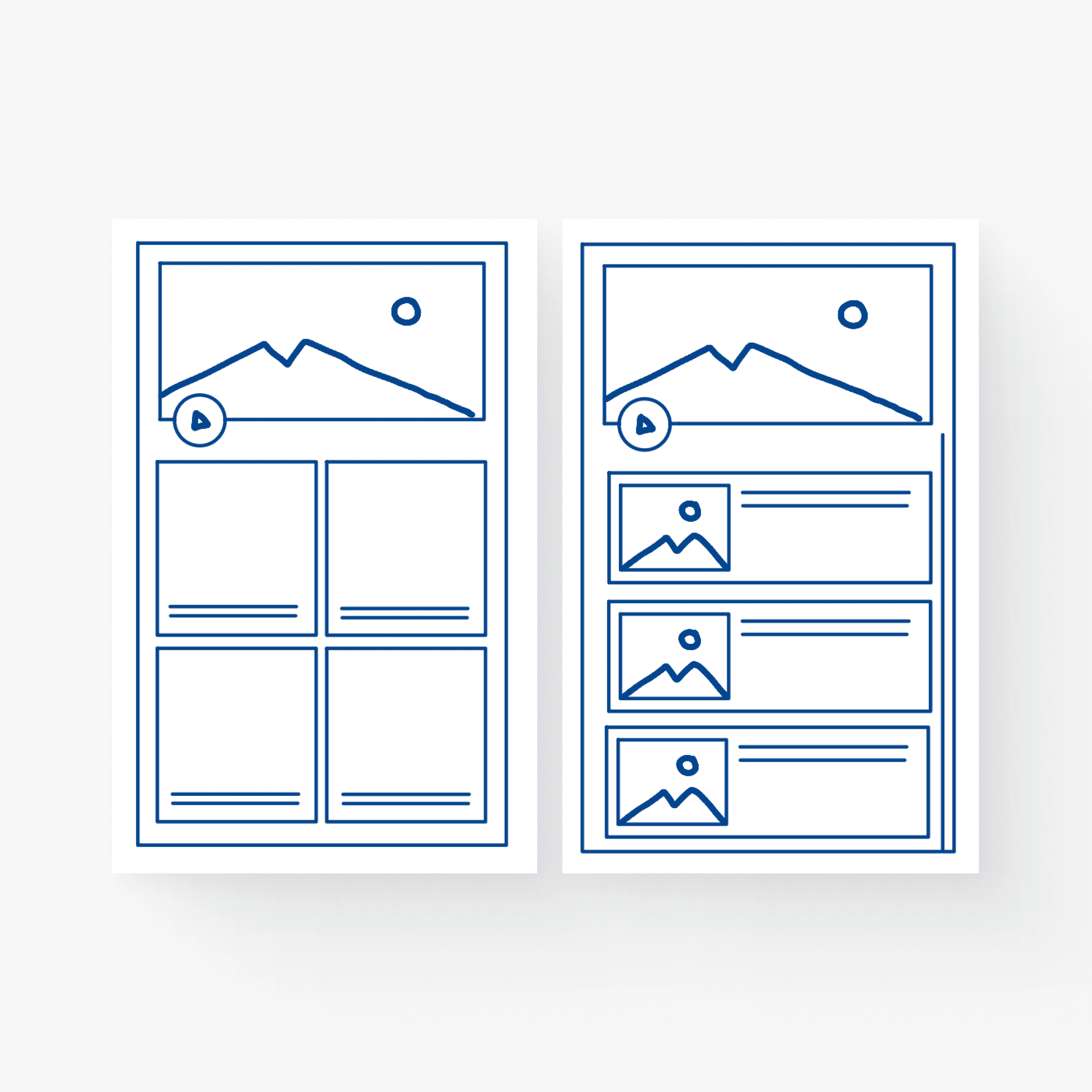
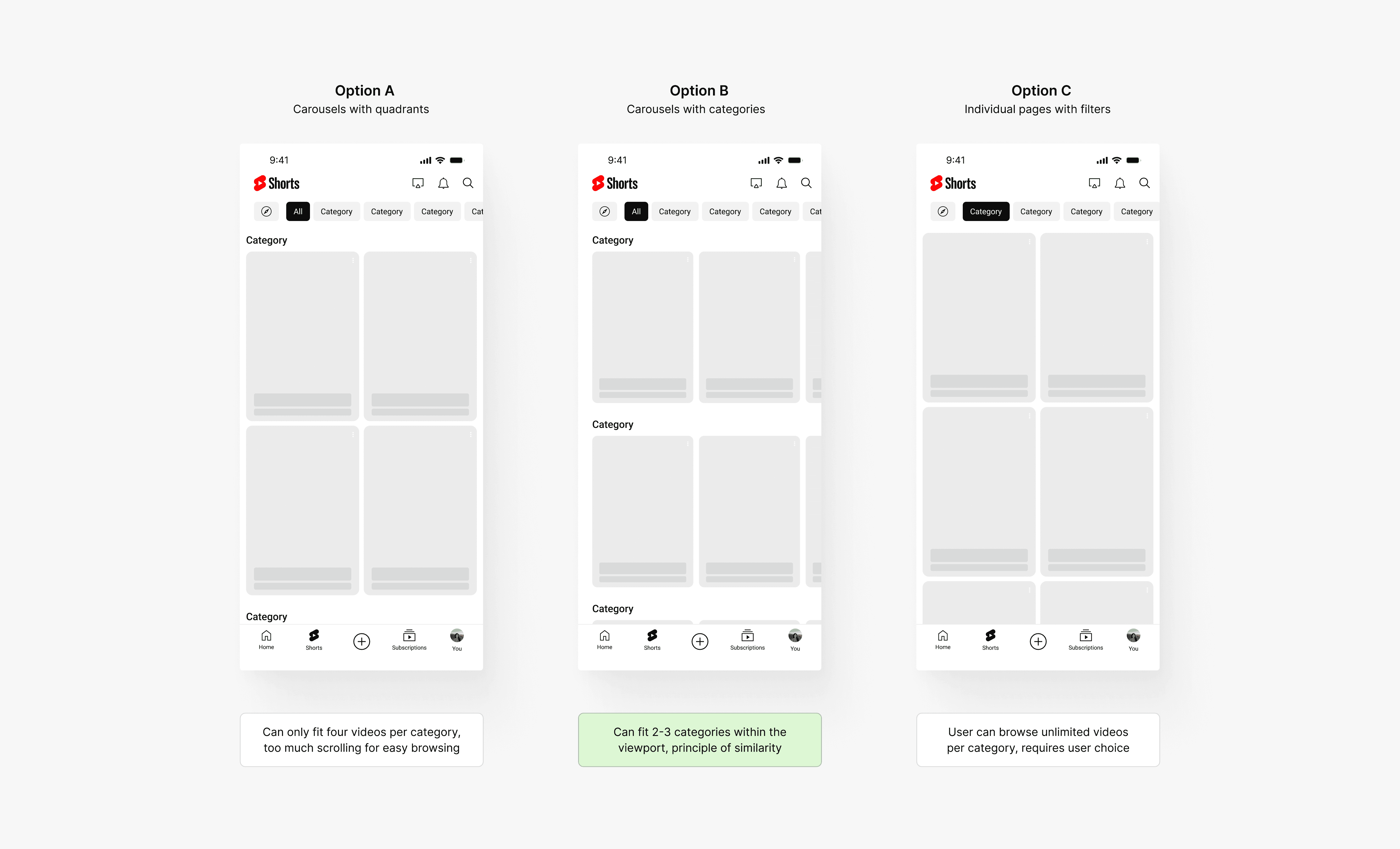
Dashboard Layout
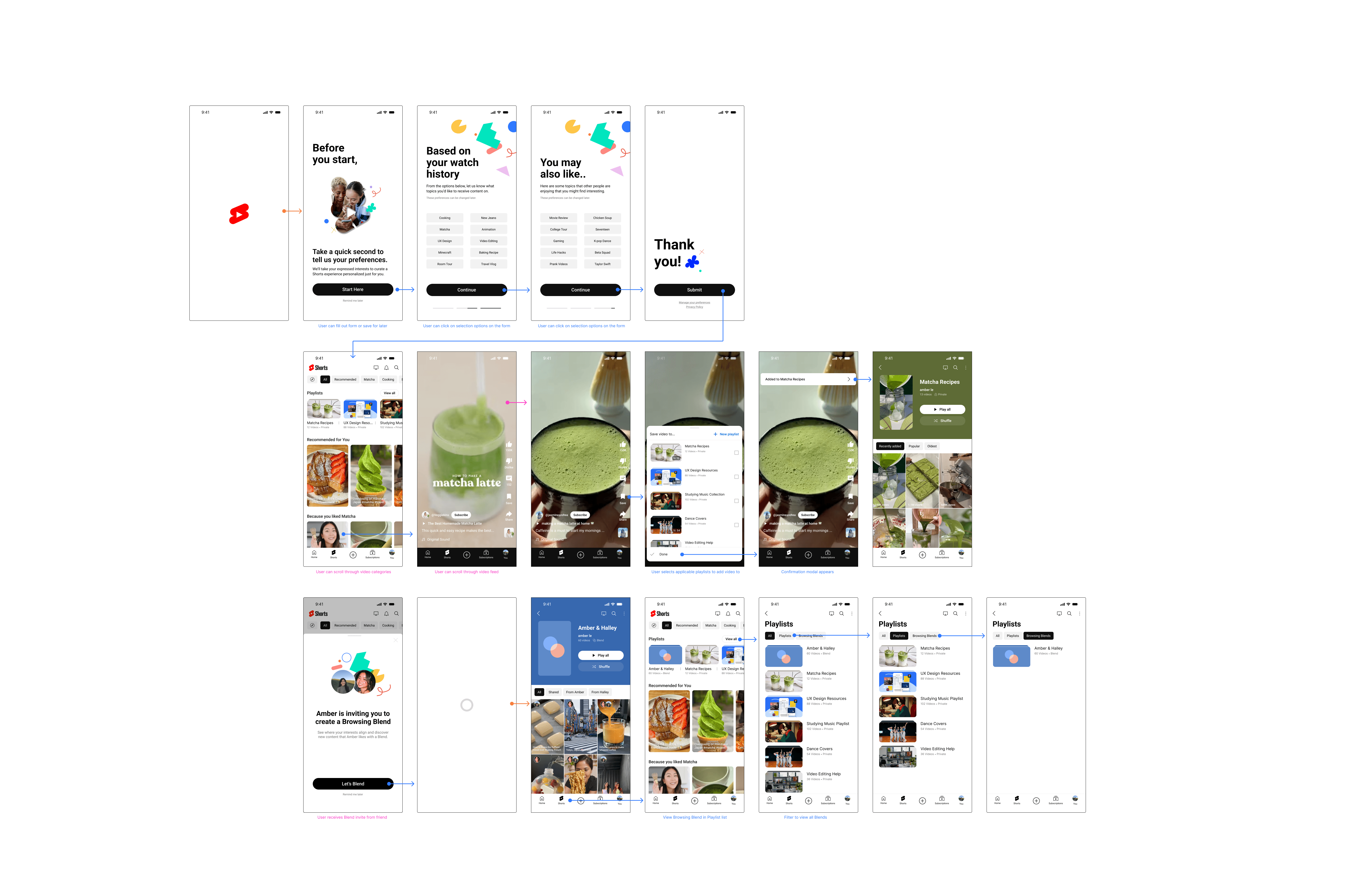
Once the onboarding form has been completed, the user is taken directly into the Shorts Dashboard, also accessible through the bottom navigation. After comparing different Shorts layouts that aligns with current experiences, I decided to choose Option B since it has a stronger Gestalt's principle of similarity.
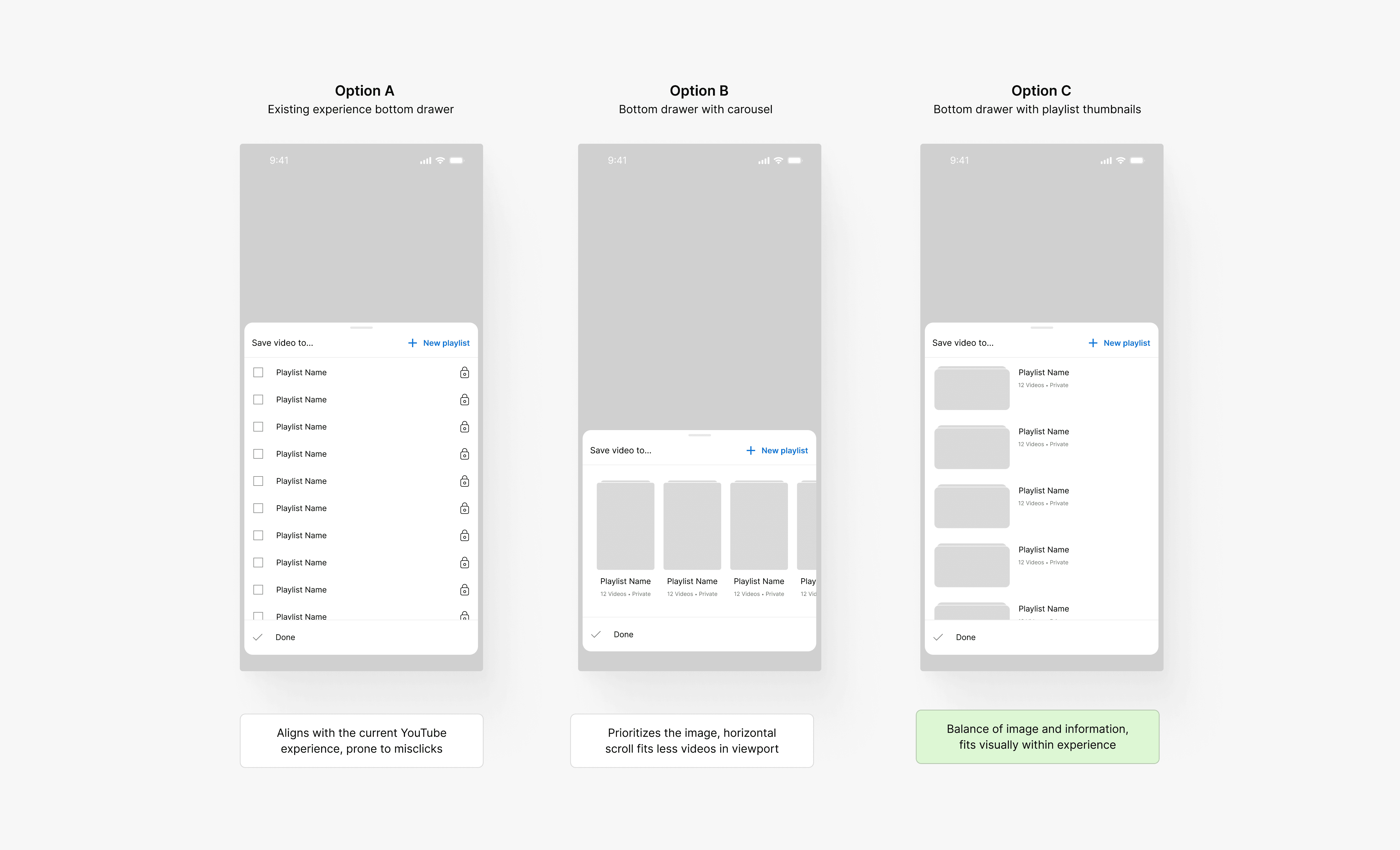
Add Video Flow
During the browsing experience, users can add videos to Playlists through the right-hand action bar, as done in the current long-form experience. I moved forward with Option C since the visual element improves scannability and reduces risk of misclicking, as well as being scalable to account for many playlists.
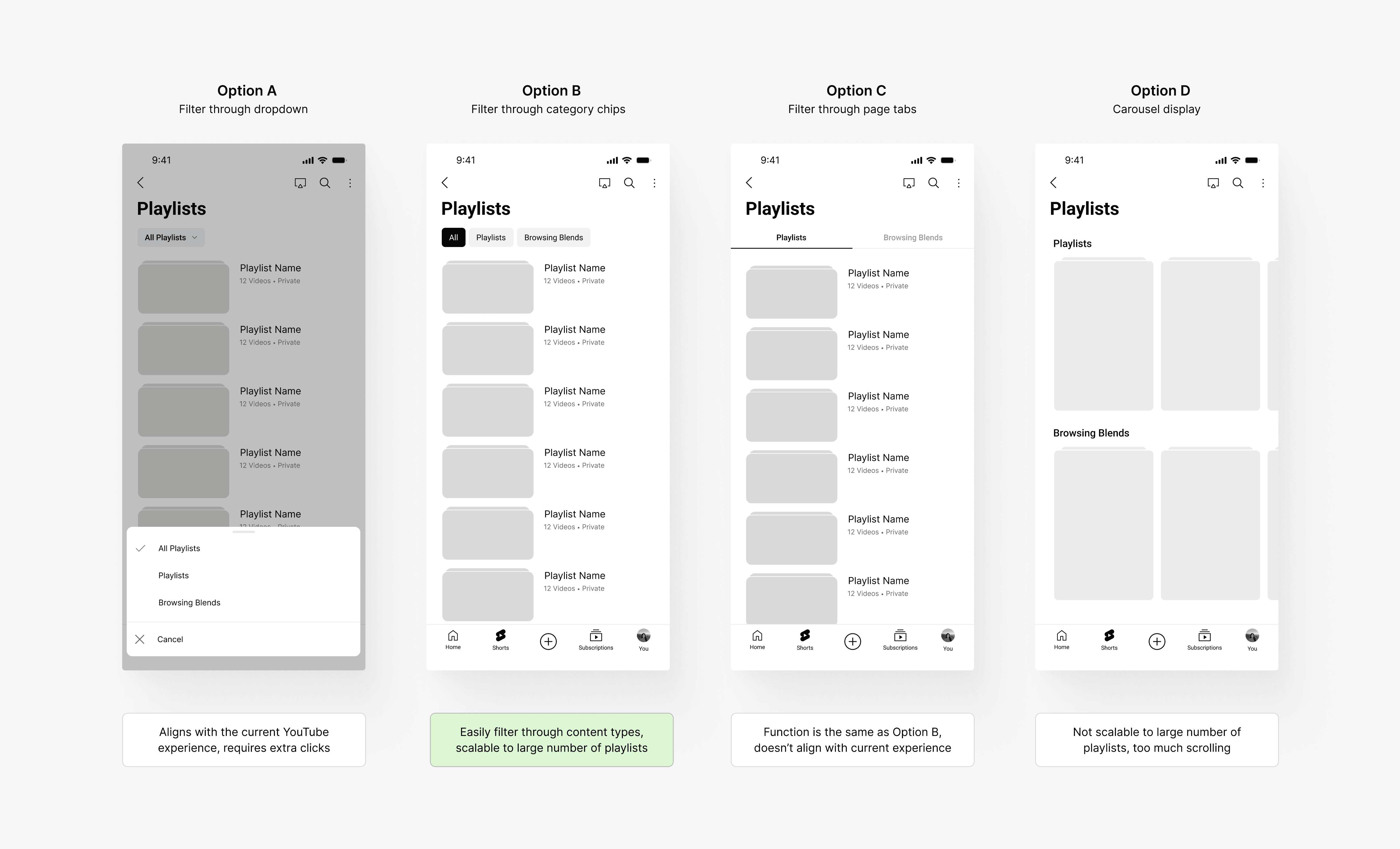
All Playlists View
Because the Browsing Blend feature is an extended feature from the Playlist idea, we recognized that the All Playlists View had to account for both regular playlists and Blends. I explored various layouts that allowed users to easily filter through all Playlists and moved forward with Option B since it aligned with other experience on the YouTube mobile app and feels intuitive, while allowing users to reach Blends in the shortest number of clicks possible.
CONNECTING THE DOTS
Feedback & Iterations
How do users access their Playlists?
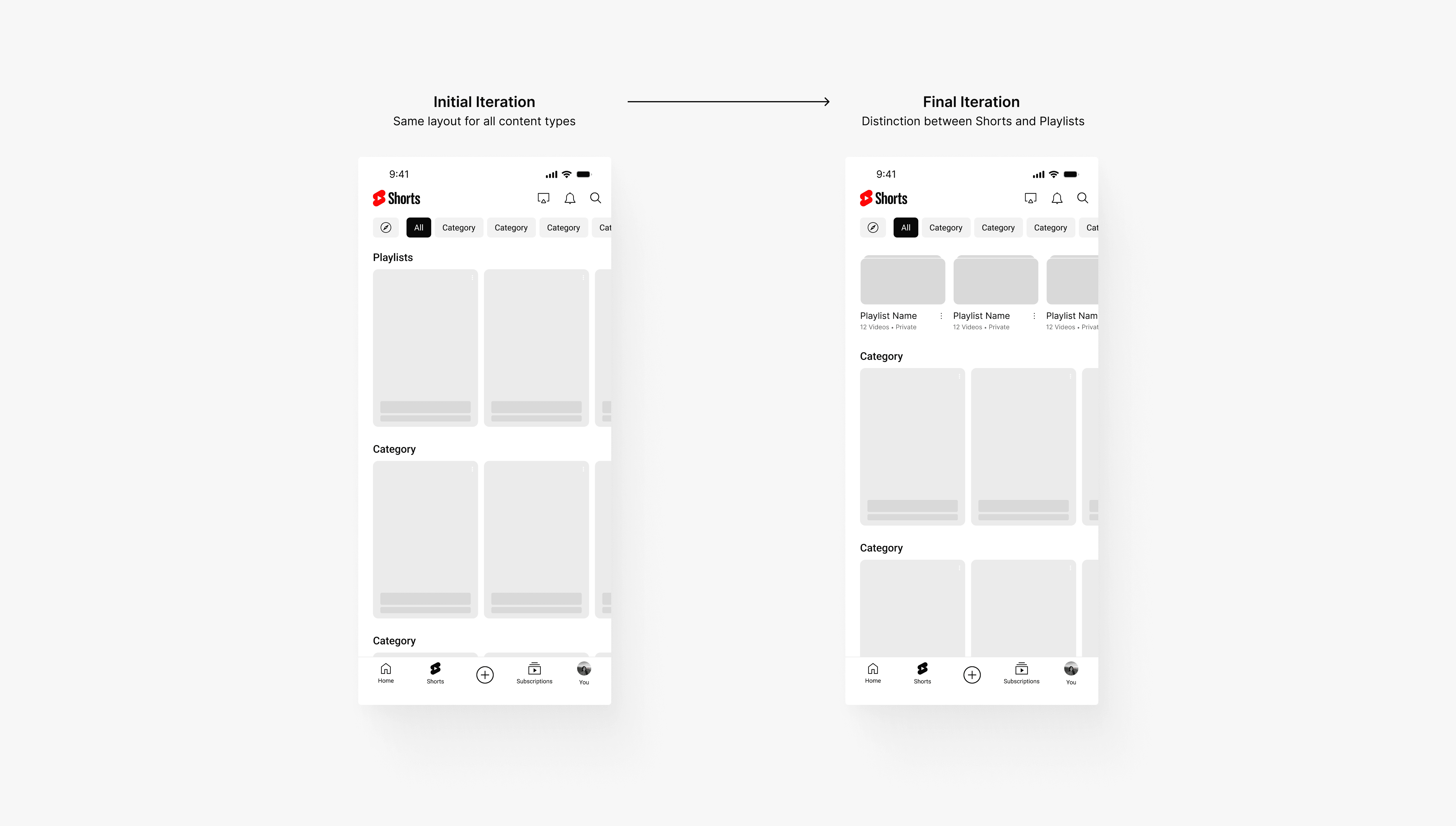
Playlists should be easily accessible from the main dashboard without drawing too much attention away from the video content. While I initially thought that following a similar layout as the dashboard would be more cohesive, I decided to align with a similar experience on the app to have enough visual distinction to feel actionable. This sheet layout previews recent Playlists and opens to the full list view through an action button at the end of the carousel.
How do users create a Blend?
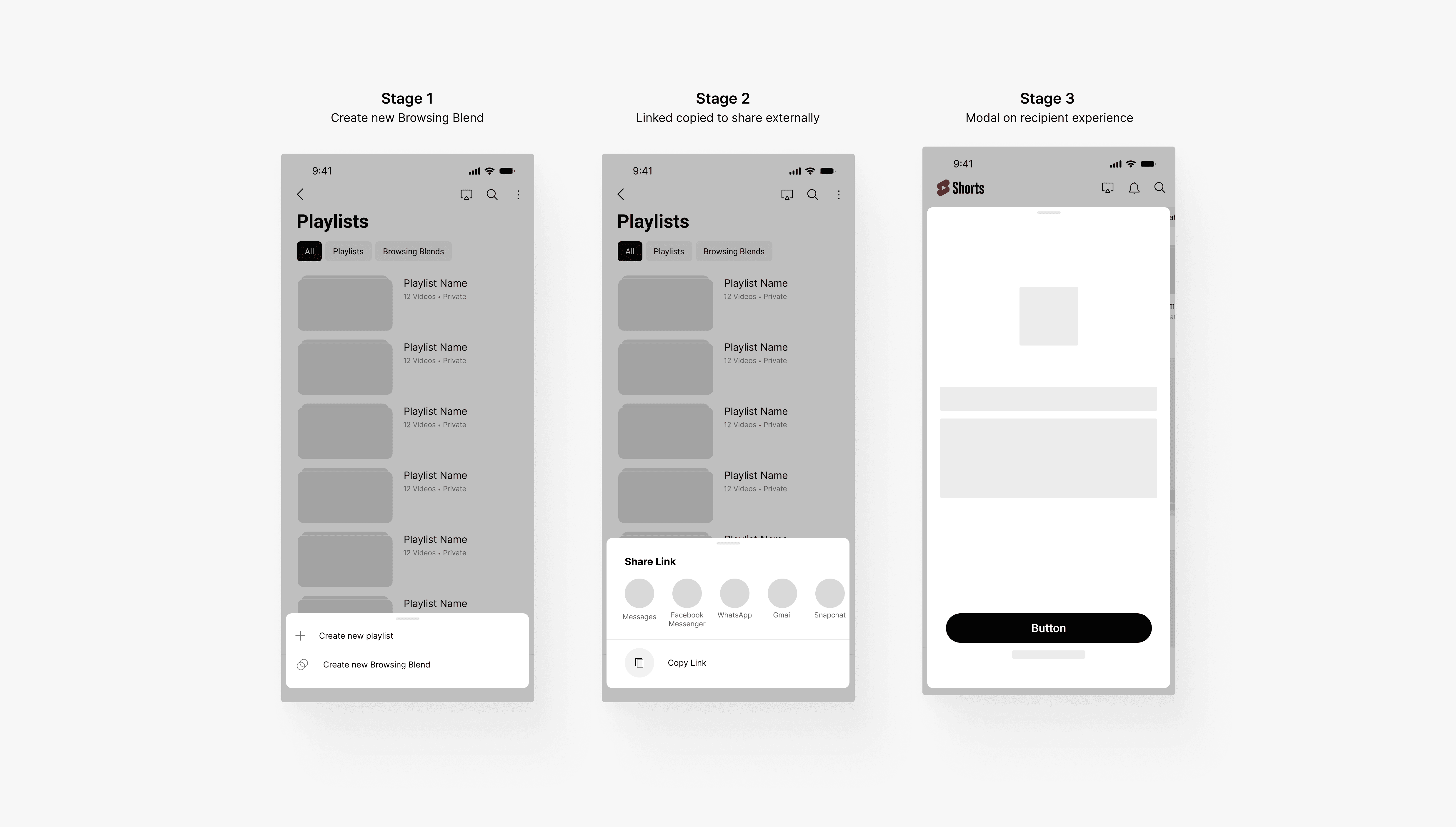
Because YouTube does not currently have an internal messaging system (which was a key contributor to user pain) and creating one would be too technically feasible, I had to consider how one could create a Browsing Blend. The best alternative was creating a unique shareable link that could be sent through direct messaging. Once clicked, the recipient will be able to generate the Browsing Blend, which will appear in both users' dashboards and All Playlists view.
FINAL FLOW
Solution Interactions
Introducing Shorts
YouTube is the leading online video sharing and social platform, garnering over 2.7 billion monthly active users and over $29.24 billion in annual revenue (2022). In September 2020, they launched YouTube Shorts, a lightweight and mobile-optimized experience centered around vertical, full-screen videos. While Shorts is also available on web, we were tasks to focused on the mobile application experience for this project scope.
BACKGROUND
Defining our users
Our point of contact at YouTube told us that there are four distinct types of defined users, ranked on a 2x2 matrix comparing intent and action. Throughout the course of this project, he asked us to focus on the needs and motivations of two these user types — the Hunter and the Gatherer. While the hunter has specific ideas of what kind of content they're looking for in the browsing experience, the gatherer has general topics of interest but is willing to explore.

THE PROBLEM SCOPE
Finding relevant and quality content when you're just browsing is hard.
As a relatively new player in the short-form content space, current users of YouTube Shorts have expressed the lack of interesting and quality content in their feed. Because of this, users tend to favor competing platforms over Shorts. With this problem in mind, our contact from YouTube was looking to uncover why this occurs and approached my team at Berkeley Innovation (human-centered design consultancy) with the following question:
HOW MIGHT WE…
Improve the Shorts browsing experience so that hunters and gathers can more easily find content that is relevant to their interests?
Because this project was exploratory and wasn't constrained by business needs or technical limitations, our contact emphasized creativity and out-of-the-box thinking to guide our process. With this in mind, we approached the problem using the four-sprint method (Research, Synthesis, Ideation, Prototyping).
GETTING STARTED
Setting our research goals
Before diving, I dissected the given project scope to understand the desired goals in greater depth. Breaking down our given "How Might We" question provided us with research objectives to better guide our design thinking process. Doing so allowed me to generate smaller subproblems that we aimed to accomplish during research so that we could consolidate which methods we wanted to conduct during our research sprint.

COMPETITIVE AUDIT
Understanding the short-form content landscape
With this context in mind, we then conducted a competitive audit of the top players in the short-form content field, including TikTok, Instagram Reels, and Facebook Reels. Through this, we analyzed the browsing mechanisms of each platform and took notes on available user functionalities and how the algorithm provides recommended videos to their users, allowing us to compare Shorts against best-in-class short-form platforms to identify areas of opportunity.

USER RESEARCH
Observing user perceptions and behavior
Although we recognized that YouTube Shorts had a less-than-ideal user experience during our competitive audit, we wanted to hear first-hand from our users to understand their motivations behind watching short-form content, allowing us to pinpoint in what areas Shorts fails to address those needs.
🗒️
User Survey
Locate common themes in what users desire in their short-form content experience, as well as understand how content relevancy is defined
💬
User Interview
Supplementing understanding on user needs and pain points with anecdotal data on previous browsing behavior and experience friction points
👀
Contextual Inquiry
Observing first-hand how both new users and old users interact with YouTube Shorts through unmoderated browsing and interaction tasks
KEY TAKEAWAY
Relevancy — how is it defined?
Showing users relevant content is the core purpose of any entertainment platform, and is even more important for short-form content. Videos must catch the attention of users within the first few minutes before they are are unengaged. Showing users videos that are relevant to them is pivotal in not only providing a satisfactory user experience, but encourages users to continue returning back to the platform. Therefore, we aimed to understand how users define content relevancy. Through our research, we learned that while users want to watch familiar content, balance with exploring new content is important.

However, this balance is something that is not being addressed in the current Shorts experience. This finding is supported by data points from white paper research comparing average watch rate of short-form content platforms. The low average watch rate on Shorts provides insight into the poor content relevancy and the lack of effectiveness of retaining user attention. Users are unlikely to watch videos that are not relevant to their interests.

THE CORE PROBLEM
YouTube Shorts isn't addressing important user needs.
With all of our research methods completed, we now had a stronger understanding of our user needs and motivations regarding short-form content platforms. Synthesizing our collected data points through affinity mapping, we ultimately recognized three key user pain points in the current Shorts experience:

Disjoint between Youtube and Shorts
Unlike competing platforms that have seamlessly integrated other content types like pictures and videos, the connection between YouTube and Shorts feels clunky and disjoint. Because of this, users have trouble accepting Shorts and would rather use YouTube as a long-form content platform.

Lack of user choice
YouTube Shorts provides no direct way for users to personalize the algorithm to their watching preferences. Users are forced to continue scrolling until they receive a Short that they enjoy — they can't choose what kind of content they begin their browsing experience with or when the content changes.

Interpersonal connection is not optimized
77.2% of survey respondents expressed that the main reason that they watch short-form content is to build connections with friends. Without the ability to easily share Shorts content to incentive conversation, users are not motivated to return back to the platform, even if the content interests them.
Therefore, both hunters and gatherers are quickly discouraged by a Shorts experience that differs from their expectations. When hunters have specific goals in mind, they have no way to choose which content they watch. While gatherers are more exploratory, once they find content that interests them, they are unable of letting the algorithm know and are stuck scrolling. The three key friction points in the experience deter users from remaining engaged.

THE GOAL
Create an elevated Shorts experience
After locating these pain points, we wanted to create a solution that empowers user choice in the browsing experience, supports the ability to create personalized experiences, and builds connections between users. Addressing these needs in our design will create a YouTube Shorts experience will successfully encourage a higher watch rate, increased user engagement, and decrease user turnover.
OUR SOLUTION
YouTube Shorts Dashboard
With the key insights identified, we began our ideation sprint. As the lead for this sprint, I was responsible for setting design goals and determining the roadmap for the sprint, while still working alongside the team as a designer. To begin, I hosted an open-ended ideation discussion. After converging on our ideas, each member of the team was interested in creating a YouTube Shorts dashboard, which would be accessed from the bottom navigation bar. We decided to focus on this touch point since this caused the most friction in the experience based on contextual inquiry sessions.

Address the touch point causing the most friction
With Shorts having three unique access points where the user can enter Shorts, we understood that we needed to narrow down our scope to ensure that our solution has the most impact but was also feasible in the remaining timeline. Referencing back to our contextual inquiries and observing which flow caused the most pain, we decided to focus on how users access videos through the Shorts player tab in the bottom navigation.
IDEATION
Guiding our solution thinking
Now that we had a general solution concept, we needed to understand which elements we were moving forward with in consideration to our timeline. After discussing each brainstormed idea, we ranked each idea based on feasibility and impact and created a prioritization pyramid based on our conversations. From these exercises, we decided to move forward with necessary features for our proposed solution rather than the "nice to have" ones.

Crazy 8's Rapid Ideation
Each designer took 8 minutes to brainstorm all potential solution ideas without limitations, generating enough concepts to further narrow down during converging. We then found common ideas through affinitizing.

Feature Prioritization
From here, I led the team to vote on which supplementary features we wanted to prioritize. We moved forward with the necessary solution ideas that address the scoped out pain points, referencing our key insights.
OUR SOLUTION FEATURES
Introducing onboarding form, playlists, and Browsing Blend
During feature prioritization, we recognized that there were many solutions that we could move forward with. However, referencing back to our key insights, we wanted to ensure that users had a chance to personalize their algorithm, create customized experiences, and build connections. Therefore, we moved forward with three features — an onboarding form, playlists, and Browsing Blend — as these ideas would provide direct intervention to those pain points.

Pre-browsing onboarding form
Provides users with an actionable step during onboarding, allowing them to create a browsing experience personalized to their interests

Shorts Playlist
Promotes personalization by allowing users to save enjoyed content for later viewing, further informing the algorithm on topics of interest

Browsing Blend
Encourages content exploration and connections with other people by generating collaborative Shorts playlists between users' algorithms

INFORMATION ARCHITECTURE
User Flow Diagram

DESIGN EXPLORATIONS
Medium-Fidelity Mockups
With our concepts consolidated and after creating mid-fi mockups, we conducted two rounds of testing with our previous interviewees to get feedback on our designs. From this, we made three major design decisions to our solutions to ensure that our designs were addressing the user points effectively.
Dashboard Layout
Once the onboarding form has been completed, the user is taken directly into the Shorts Dashboard, also accessible through the bottom navigation. After comparing different Shorts layouts that aligns with current experiences, I decided to choose Option B since it has a stronger Gestalt's principle of similarity.

Add Video Flow
During the browsing experience, users can add videos to Playlists through the right-hand action bar, as done in the current long-form experience. I moved forward with Option C since the visual element improves scannability and reduces risk of misclicking, as well as being scalable to account for many playlists.

All Playlists View
Because the Browsing Blend feature is an extended feature from the Playlist idea, we recognized that the All Playlists View had to account for both regular playlists and Blends. I explored various layouts that allowed users to easily filter through all Playlists and moved forward with Option B since it aligned with other experience on the YouTube mobile app and feels intuitive, while allowing users to reach Blends in the shortest number of clicks possible.

CONNECTING THE DOTS
Feedback & Iterations
How do users access their Playlists?
Playlists should be easily accessible from the main dashboard without drawing too much attention away from the video content. While I initially thought that following a similar layout as the dashboard would be more cohesive, I decided to align with a similar experience on the app to have enough visual distinction to feel actionable. This sheet layout previews recent Playlists and opens to the full list view through an action button at the end of the carousel.

How do users create a Blend?
Because YouTube does not currently have an internal messaging system (which was a key contributor to user pain) and creating one would be too technically feasible, I had to consider how one could create a Browsing Blend. The best alternative was creating a unique shareable link that could be sent through direct messaging. Once clicked, the recipient will be able to generate the Browsing Blend, which will appear in both users' dashboards and All Playlists view.

FINAL FLOW
Solution Interactions

CORE EXPERIENCES
Elevating YouTube Shorts
Onboarding Form
Customize your Shorts experience by selecting topics of interest and exploration based on watch history
Shorts Dashboard
Select content relevant to your current interests in Dashboard, a seamless connection between YouTube and Shorts
Playlists
Save and collect liked content in Playlists for later viewing, easy access from the Dashboard
Browsing Blend
Generate a curated playlist with you and a friend's algorithm, so you can watch familiar content while exploring new topics
USER INTERFACE
Dark Mode
To account for the different user experiences, I also created a version for dark mode. Through this prototyping practice, I learned nuances between different modes while providing an option that reduces eye strain in low-light conditions, and enhancing focus and productivity especially for late-night users.
